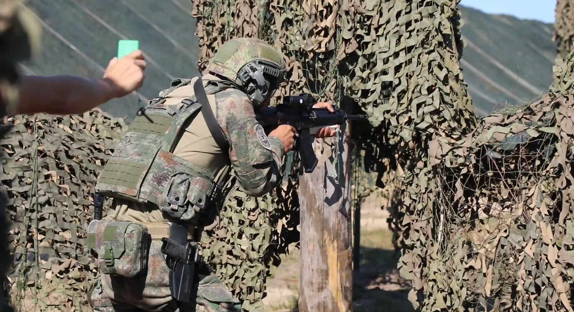
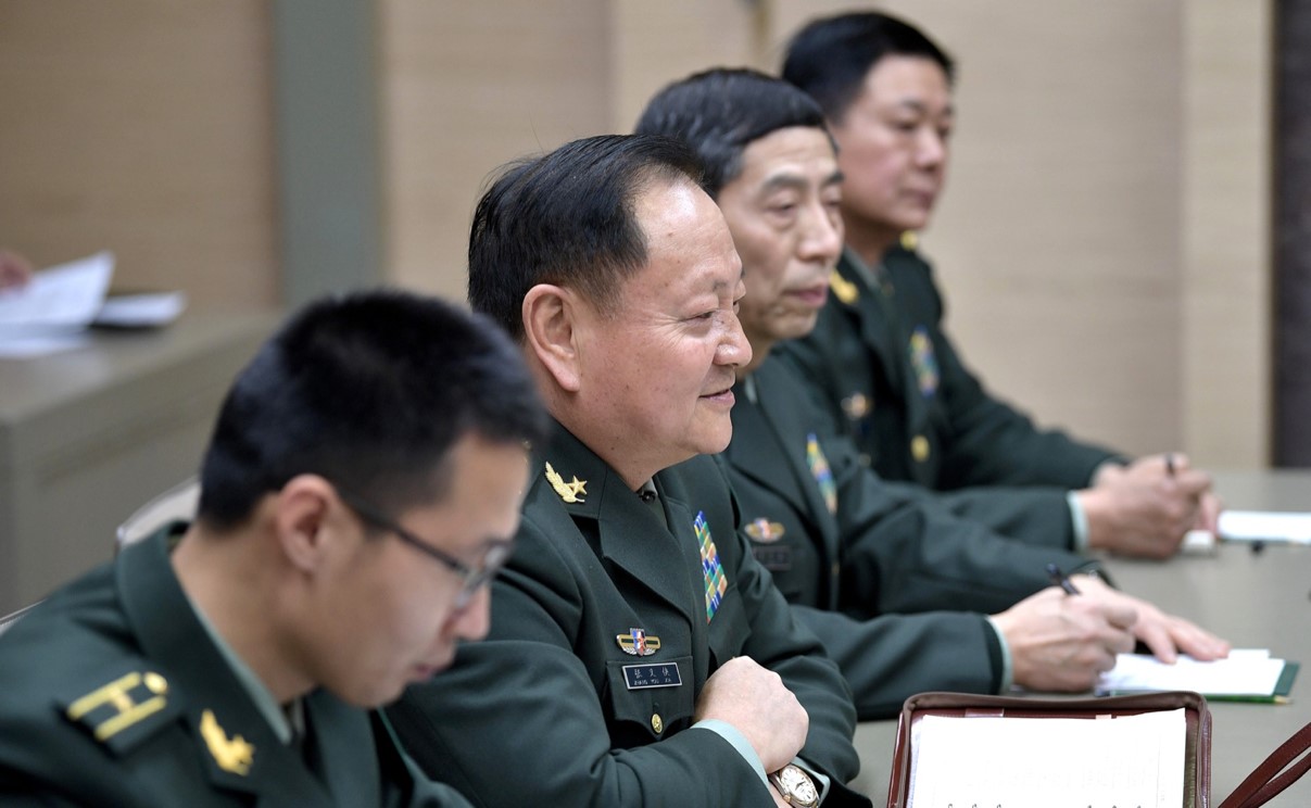
This paper examines the PLA’s reforms targeting the development of joint commanders and staff, and efforts to improve joint training. Qualified joint officers and a well-trained joint force are fundamental requirements to propel the PLA into the echelons of the world’s advanced militaries. The PLA’s military education reform effort is to improve the quality of personnel in general, but an important emphasis of the current military educational reforms is focused on joint commanders and staff. The PLA intends to instill a general level of joint knowledge throughout the entire military as it pushes joint operations capabilities down to the tactical level. While the detailed outline of these reforms is known, the full extent and quality of implemented reforms is difficult to gauge.
Great Power Competition continues the discussion begun with the 2017 Cultural Perspectives, Geopolitics, & Energy Security of Eurasia: Is the Next Global Conflict Imminent? This second volume undertakes a deep analysis beyond the obvious military strategic nexus to identify new spaces for planners and policymakers alike to consider. Similar to Cultural Perspectives, distinguished nationally and internationally known scholars in their respective areas discuss how emerging global and regional powers are trying to expand their influences in Eurasia, the Americas, and Africa, among other regions. The scholars, who bring a combination of academic and first-hand practical expertise, examine how the actions of adversaries such as Russia, China, and Iran in a greater Eurasia landscape and beyond have challenged the US National Security Strategy and National Defense Strategy. These actions include continuous efforts to challenge US interests in the Middle East, Southwest Asia, the Western Hemisphere and Africa, especially in the changing homeland security landscape in light of COVID-19 and recent societal unrest. Click Here for Publication Site
This monograph examines current People’s Liberation Army (PLA) Army campaign doctrine, with a discussion of PLA theorists’ vision of the evolutionary development of warfare to provide context for current doctrine as well as potential future direction. The PLA develops doctrinal joint and service campaign scenarios for possible offensive and defensive operations. PLA campaigns represent the operational level of war between strategic operations and tactical combat. The PLA’s current focus on specific campaigns provides insight into Beijing’s perception of potential conflict scenarios. The campaign scenarios provide commanders and staff data on command and control, coordination, combat actions, support, and other critical campaign elements for specific operational environments. The description of each campaign’s operational environment and combat actions provides valuable support to operational planning and a context for staff and unit training for their specific operational mission. The Army campaigns are executed as components of a joint campaign, or as a primarily independent Army campaign with support from other services.
The Chinese way of war has changed dramatically from what it was 20 years ago, but that does not mean everything is new. Some components of People’s Liberation Army (PLA) historic thought (deception, stratagems, etc.) remain as important elements and are being integrated into technologies. However, China’s intelligentization of operations and focus on joint and all-domain capabilities (to include some domains not currently under consideration in the US) create new challenges. Artificial intelligence (AI) is now being used to help design warfare and provide control over conflicts, ensuring that the PLA has a future deterrent force to confront other nations. It appears that China will remain a formidable opponent for many years to come.
Welcome to image alignment! If you recognize this post, it is because these are blocks that have been converted from the classic Markup: Image Alignment post. The best way to demonstrate the ebb and flow of the various image positioning options is to nestle them snuggly among an ocean of words. Grab a paddle and let’s get started. Be sure to try it in RTL mode. Left should stay left and right should stay right for both reading directions.
On the topic of alignment, it should be noted that users can choose from the options of None, Left, Right, and Center. If the theme has added support for align wide, images can also be wide and full width. Be sure to test this page in RTL mode.
In addition, they also get the options of the image dimensions 25%, 50%, 75%, 100% or a set width and height.
The image above happens to be centered.
The rest of this paragraph is filler for the sake of seeing the text wrap around the 150×150 image, which is left aligned.
As you can see the should be some space above, below, and to the right of the image. The text should not be creeping on the image. Creeping is just not right. Images need breathing room too. Let them speak like you words. Let them do their jobs without any hassle from the text. In about one more sentence here, we’ll see that the text moves from the right of the image down below the image in seamless transition. Again, letting the do it’s thang. Mission accomplished!
And now for a massively large image. It also has no alignment.
The image above, though 1200px wide, should not overflow the content area. It should remain contained with no visible disruption to the flow of content.
And now we’re going to shift things to the right align. Again, there should be plenty of room above, below, and to the left of the image. Just look at him there… Hey guy! Way to rock that right side. I don’t care what the left aligned image says, you look great. Don’t let anyone else tell you differently.
In just a bit here, you should see the text start to wrap below the right aligned image and settle in nicely. There should still be plenty of room and everything should be sitting pretty. Yeah… Just like that. It never felt so good to be right.
And just when you thought we were done, we’re going to do them all over again with captions!
The image above happens to be centered. The caption also has a link in it, just to see if it does anything funky.
The rest of this paragraph is filler for the sake of seeing the text wrap around the 150×150 image, which is left aligned.
As you can see the should be some space above, below, and to the right of the image. The text should not be creeping on the image. Creeping is just not right. Images need breathing room too. Let them speak like you words. Let them do their jobs without any hassle from the text. In about one more sentence here, we’ll see that the text moves from the right of the image down below the image in seamless transition. Again, letting the do it’s thang. Mission accomplished!
And now for a massively large image. It also has no alignment.
The image above, though 1200px wide, should not overflow the content area. It should remain contained with no visible disruption to the flow of content.
And now we’re going to shift things to the right align. Again, there should be plenty of room above, below, and to the left of the image. Just look at him there… Hey guy! Way to rock that right side. I don’t care what the left aligned image says, you look great. Don’t let anyone else tell you differently.
In just a bit here, you should see the text start to wrap below the right aligned image and settle in nicely. There should still be plenty of room and everything should be sitting pretty. Yeah… Just like that. It never felt so good to be right.
Imagine that we would find a use for the extra wide image! This image has the wide width alignment:
Can we go bigger? This image has the full width alignment:
And that’s a wrap, yo! You survived the tumultuous waters of alignment. Image alignment achievement unlocked! One last thing: The last item in this post’s content is a thumbnail floated right. Make sure any elements after the content are clearing properly.
Maecenas suscipit, risus et eleifend imperdiet, nisi orci ullamcorper massa, et adipiscing orci velit quis magna. Praesent sit amet ligula id orci venenatis auctor. Phasellus porttitor, metus non tincidunt dapibus, orci pede pretium neque, sit amet adipiscing ipsum lectus et libero. Aenean bibendum. Curabitur mattis quam id urna.
Vivamus dui. Donec nonummy lacinia lorem. Cras risus arcu, sodales ac, ultrices ac, mollis quis, justo. Sed a libero. Quisque risus erat, posuere at, tristique non, lacinia quis, eros.
Gallery blocks have two settings: the number of columns, and whether or not images should be cropped. The default number of columns is three, and the maximum number of columns is eight.
Below is a three column gallery at full width, with cropped images.
Boat BW PB Barco Texture Beautiful Fishing
Some more text for taking up space.
A two column gallery, aligned to the left, linked to media file.
In the editor, the image captions can be edited directly by clicking on the text.
If the number of images cannot be divided into the number of columns you have selected, the default is to have the last image(s) automatically stretch to the width of your gallery.
A four column gallery with a wide width:
Sunrise over the coast in Huatulco, Oaxaca, Mexico
Lorem ipsum dolor sit amet, consectetuer adipiscing elit. Donec mollis. Quisque convallis libero in sapien pharetra tincidunt. Aliquam elit ante, malesuada id,
tempor eu, gravida id, odio. Maecenas suscipit, risus et eleifend imperdiet, nisi orci ullamcorper massa, et adipiscing orci velit quis magna.
A five column gallery with normal images:
This is the same gallery, but with cropped images.
Six columns: does it work at all window sizes?
Boardwalk at Westport, WA
Golden Gate Bridge
Sydney Harbor Bridge
Bell on wharf in San Francisco
Rusty rails with fishplate, Kojonup
Boats and reflections, Royal Perth Yacht Club
Antique farm machinery, Mount Barker Museum, Western Australia
Raindrop ripples on a pond
Albany wind-farm against the sunset, Western Australia
Lorem ipsum dolor sit amet, consectetuer adipiscing elit. Donec mollis. Quisque convallis libero in sapien pharetra tincidunt. Aliquam elit ante, malesuada id, tempor eu, gravida id, odio. Maecenas suscipit, risus et eleifend imperdiet, nisi orci ullamcorper massa, et adipiscing orci velit quis magna.
Windmill shrouded in fog at a farm outside of Walker, Iowa
Jericoacoara Ceara Brasil
Sunrise over the coast in Huatulco, Oaxaca, Mexico
Seven columns: how does this look on a narrow window?
It’s dangerous to go alone! Take this.
Boat BW PB Barco Texture Beautiful Fishing
Coastline in Huatulco, Oaxaca, Mexico
Jericoacoara Ceara Brasil
Sunrise over the coast in Huatulco, Oaxaca, Mexico
Beach at Big Sur, CA
Windmill shrouded in fog at a farm outside of Walker, Iowa
Sea and rocks, Plimmerton, New Zealand
Rusty rails with fishplate, Kojonup
images linked to media file – do captions obscure links?
Eight columns:
Lorem ipsum dolor sit amet, consectetuer adipiscing elit. Donec mollis. Quisque convallis libero in sapien pharetra tincidunt. Aliquam elit ante, malesuada id, tempor eu, gravida id, odio. Maecenas suscipit, risus et eleifend imperdiet, nisi orci ullamcorper massa, et adipiscing orci velit quis magna.
Boardwalk at Westport, WA
Golden Gate Bridge
Antique farm machinery, Mount Barker Museum, Western Australia
Orange Iris
Albany wind-farm against the sunset, Western Australia
This page tests how the theme displays the columns block. The first block tests a two column block with paragraphs.
This is the second column. It should align next to the first column. Reduce the browser window width to test the responsiveness.
This is the second column block. It has 3 columns.
Paragraph 2 is in the middle.
Paragraph 3 is in the last column.
The third column block has 4 columns. Make sure that all the text is visible and that it is not cut off.
Now the columns are getting narrower.
The margins between the columns should be wide enough,
so that the content of the columns does not run into or overlap each other.
Column one.
Column two.
Column three.
Column four.
Column five.
To change the number of columns, select the column block to open the settings panel. You can show up to 6 columns. If the theme has support for wide align, you can also set the alignments to wide and full width.
Below is a column block with six columns, and no alignment:
Column one.
Column two.
Column three.
Column four.
Column five.
Column six.
Next is a 3 column block, with a wide alignment:
Column one.
Column two.
Column three.
And here is a two column block with full width, and a longer text. Make sure that the text wraps correctly.
This is column one. Sometimes, you may want to use columns to display a larger text, so, lets add some more words. Lorem ipsum dolor sit amet, consectetuer adipiscing elit. Donec mollis. Quisque convallis libero in sapien pharetra tincidunt. Aliquam elit ante, malesuada id, tempor eu, gravida id, odio. Maecenas suscipit, risus et eleifend imperdiet, nisi orci ullamcorper massa, et adipiscing orci velit quis magna. Praesent sit amet ligula id orci venenatis auctor. Phasellus porttitor, metus non tincidunt dapibus, orci pede pretium neque, sit amet adipiscing ipsum lectus et libero. Aenean bibendum. Curabitur mattis quam id urna. Vivamus dui. Donec nonummy lacinia lorem. Cras risus arcu, sodales ac, ultrices ac, mollis quis, justo. Sed a libero. Quisque risus erat, posuere at, tristique non, lacinia quis, eros.
Column two. Cras volutpat, lacus quis semper pharetra, nisi enim dignissim est, et sollicitudin quam ipsum vel mi. Sed commodo urna ac urna. Nullam eu tortor. Curabitur sodales scelerisque magna. Donec ultricies tristique pede. Nullam libero. Nam sollicitudin felis vel metus. Nullam posuere molestie metus. Nullam molestie, nunc id suscipit rhoncus, felis mi vulputate lacus, a ultrices tortor dolor eget augue. Aenean ultricies felis ut turpis. Lorem ipsum dolor sit amet, consectetuer adipiscing elit. Suspendisse placerat tellus ac nulla. Proin adipiscing sem ac risus. Maecenas nisi. Cras semper.
We can also add blocks inside columns:
This is a numbered list,
inside a 3 column block
with a wide alignment.
The middle column has a paragraph with an image block below.
Lorem ipsum dolor sit amet, consectetuer adipiscing elit. Donec mollis. Quisque convallis libero in sapien pharetra tincidunt. Aliquam elit ante, malesuada id, tempor eu, gravida id, odio. Maecenas suscipit, risus et eleifend imperdiet, nisi orci ullamcorper massa, et adipiscing orci velit quis magna.
-This third column has a quote
Theme Reviewer
But wait there is more! We also have a block called Media & Text, which is a two column block that helps you display media and text content next to each other, without having to first setup a column block:
Media & Text
A paragraph block sits ready to be used, below your headline.
Yes, it is a press, certainly, but a press from which shall flow in inexhaustible streams, the most abundant and most marvelous liquor that has ever flowed to relieve the thirst of men!
Johannes Gutenberg
The quote blocks themselves have no alignments but the text can be aligned, bold, italic, and linked:
The Common category includes the following blocks: Paragraph, image, headings, list, gallery, quote, audio, cover, video.
The paragraph block is the default block type. It should not have any alignment of any kind. It should just flow like you would normally expect. Nothing fancy. Just straight up text, free flowing, with love.
This paragraph is left aligned.
This italic paragraph is right aligned.
Neither of these paragraphs care about politics, but this one is bold, medium sized and has a drop cap.
This paragraph is centered.
This paragraph prefers Jazz over Justin Timberlake. It also uses the small font size.
This paragraph has something important to say: It has a large font size, which defaults to 36px.
The huge text size defaults to 46px, but the size can be customized.
This paragraph is colorful, with a red background and white text (maybe). Colored blocks should have a high enough contrast, so that the text is readable.
Below this block, you will see a single image with a circle mask applied.